Reports
Understand the story behind your spending
Turn transactions into clear views of spending, income, and cash flow. See what changed over time and explore the purchases behind the numbers.
Spending and income
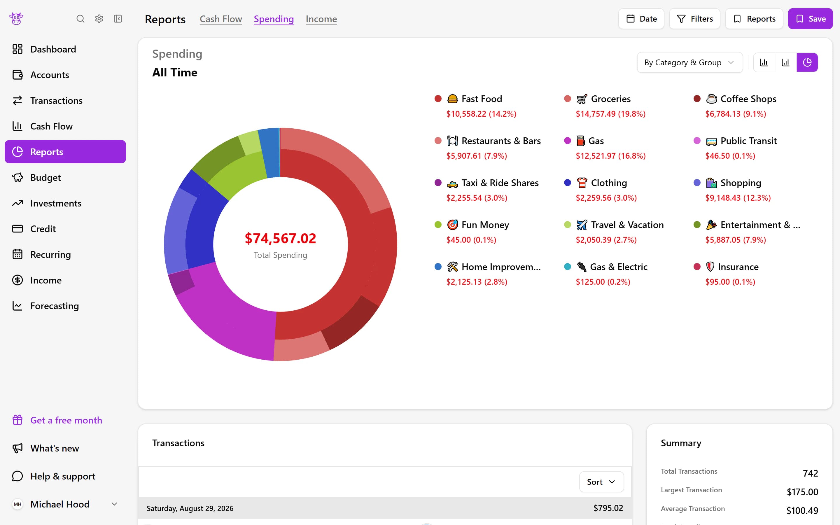
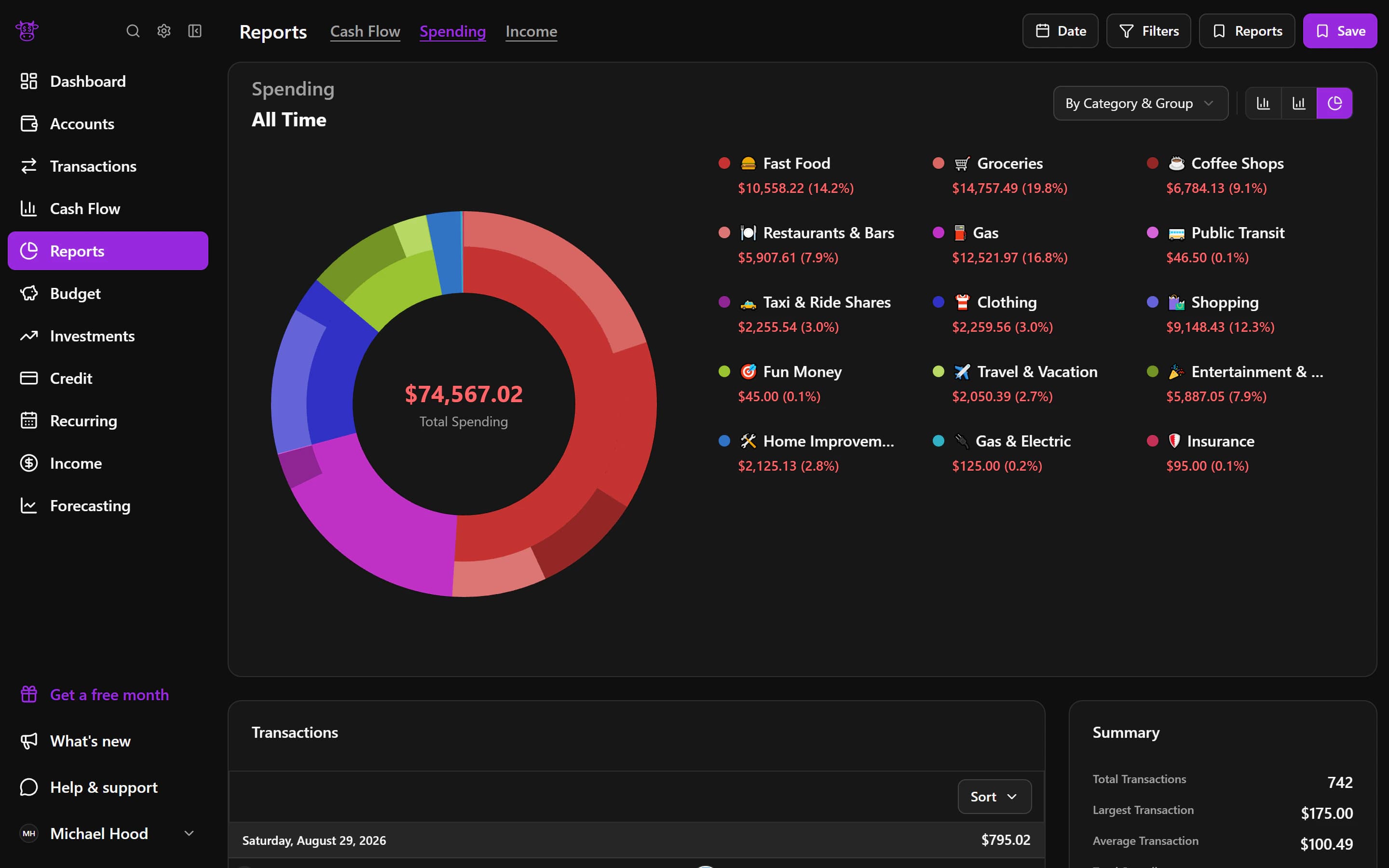
See where the month went
A spending chart shows which categories took the largest share of your money during the period you choose. Switch to Income when you want to understand money coming in. Both views make patterns easier to see than a long transaction list alone.
Sankey
Follow money from income to expenses
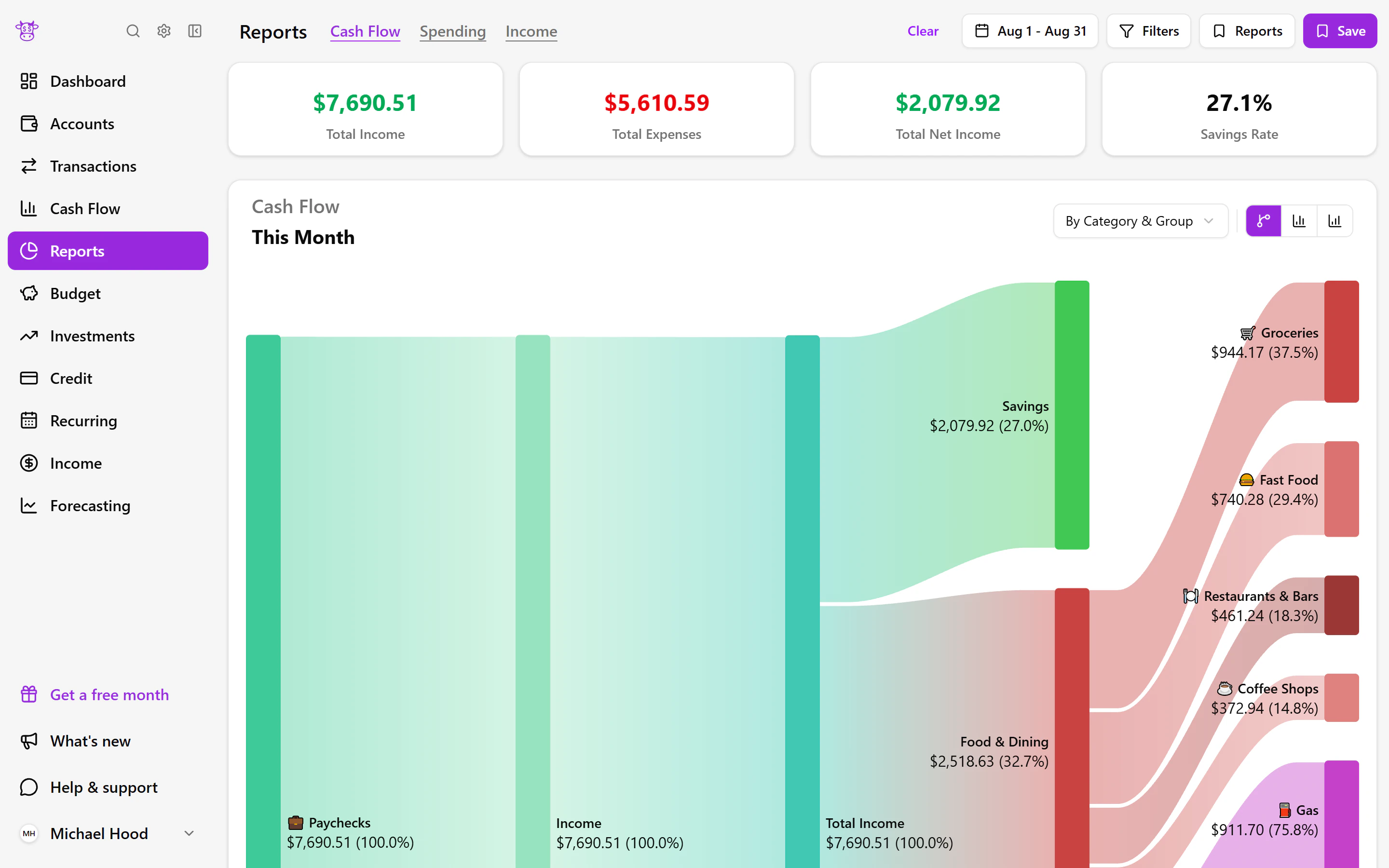
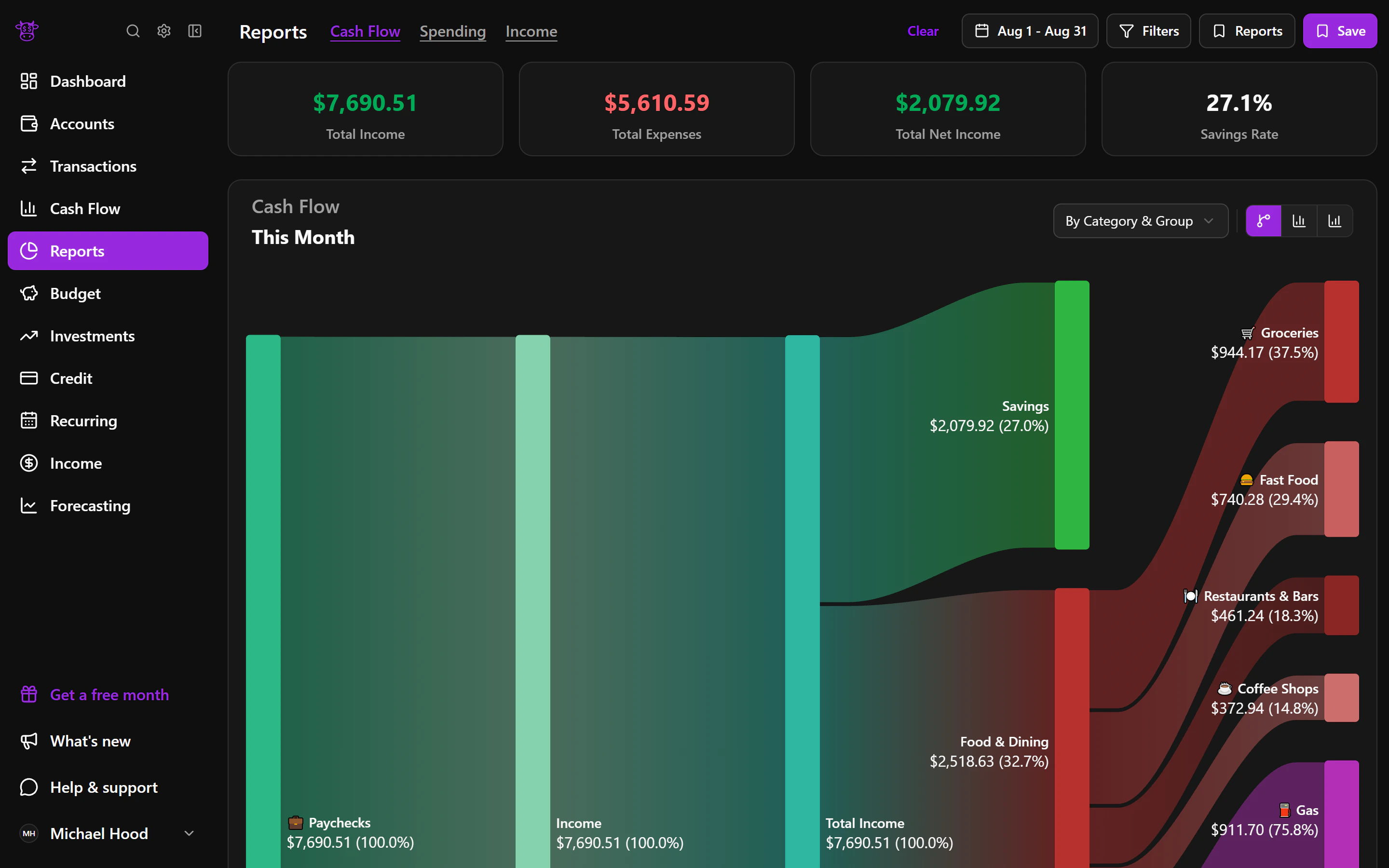
The flow chart draws a path from money coming in to the groups and categories where it went. It helps answer a simple question: after income arrived, what used the biggest portions? You can understand the month at a glance before exploring any detail.
Cash flow
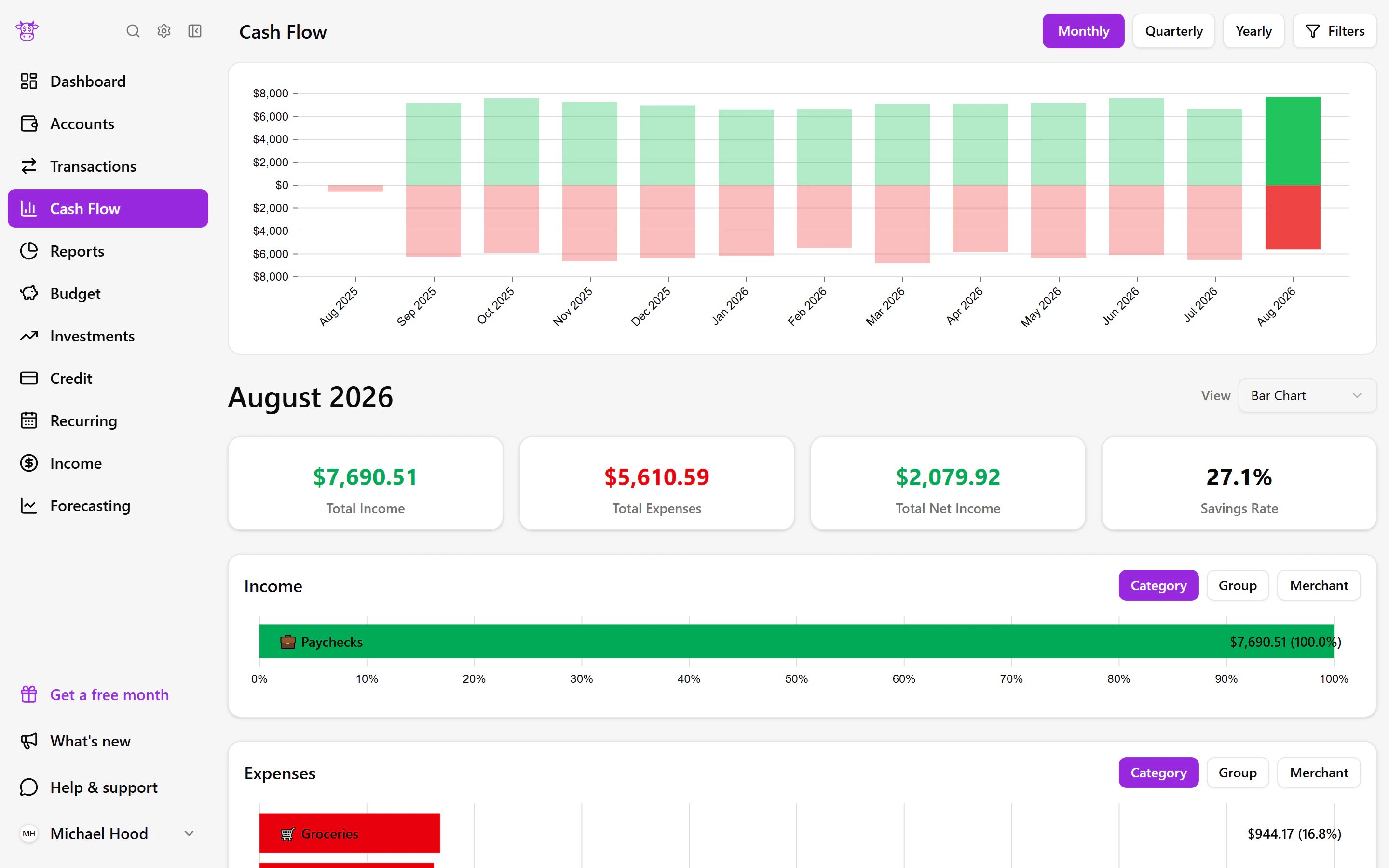
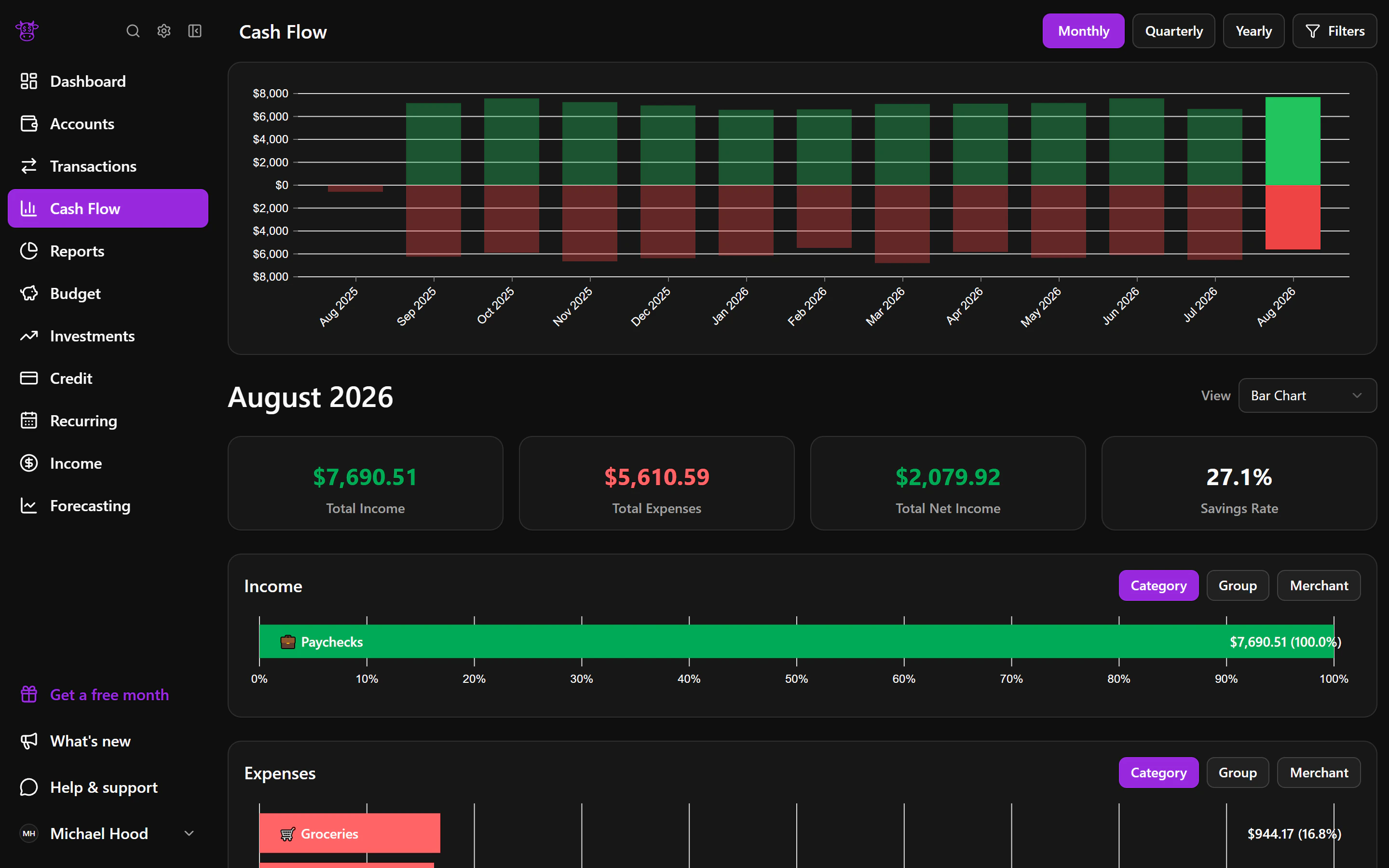
Know whether you spent more than you earned
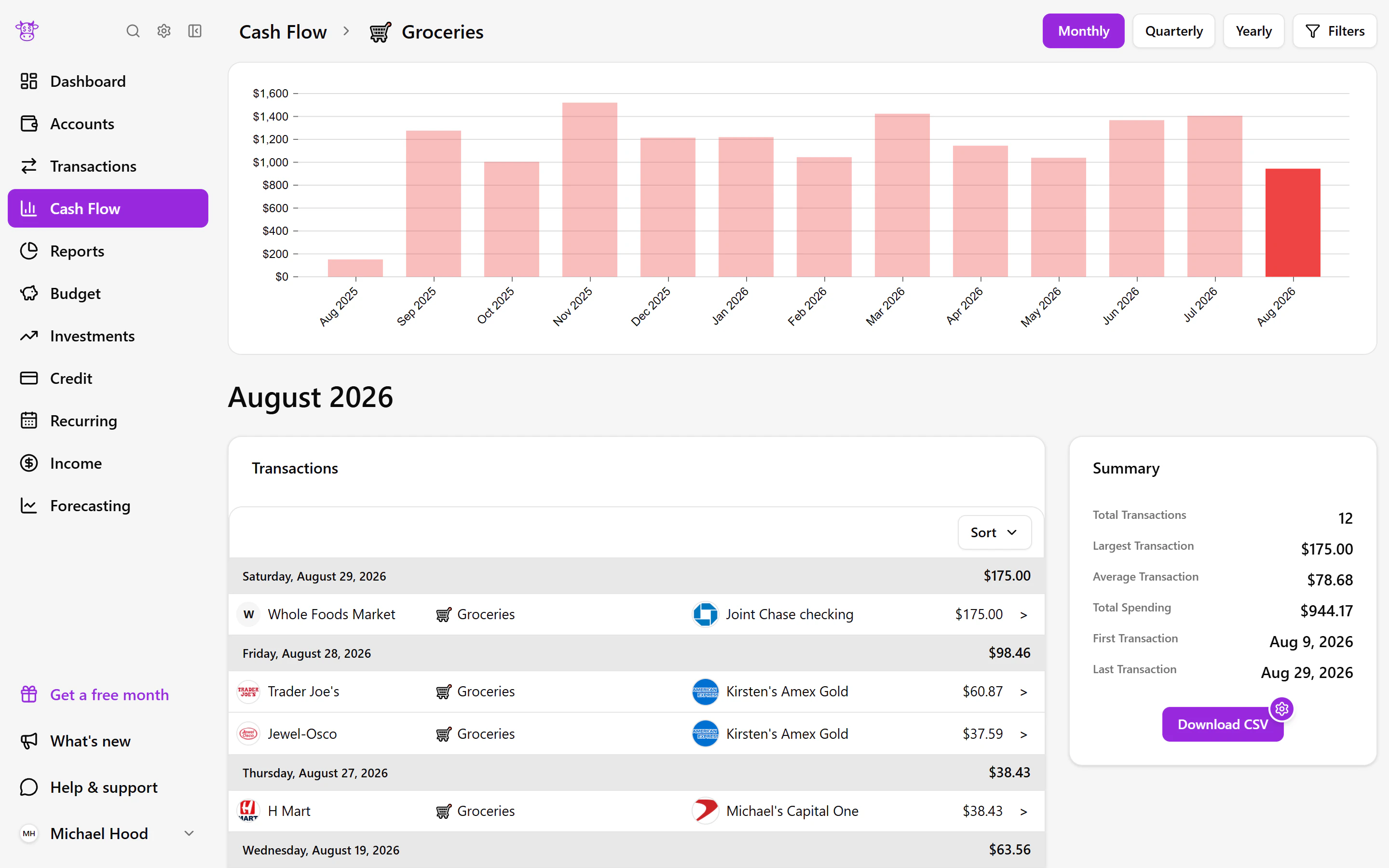
Cash Flow puts income, expenses, and the difference between them side by side. Looking across months can show whether a change came from spending more, earning less, or both, giving you a more useful starting point than a single total.
Explore
Find what shaped a change
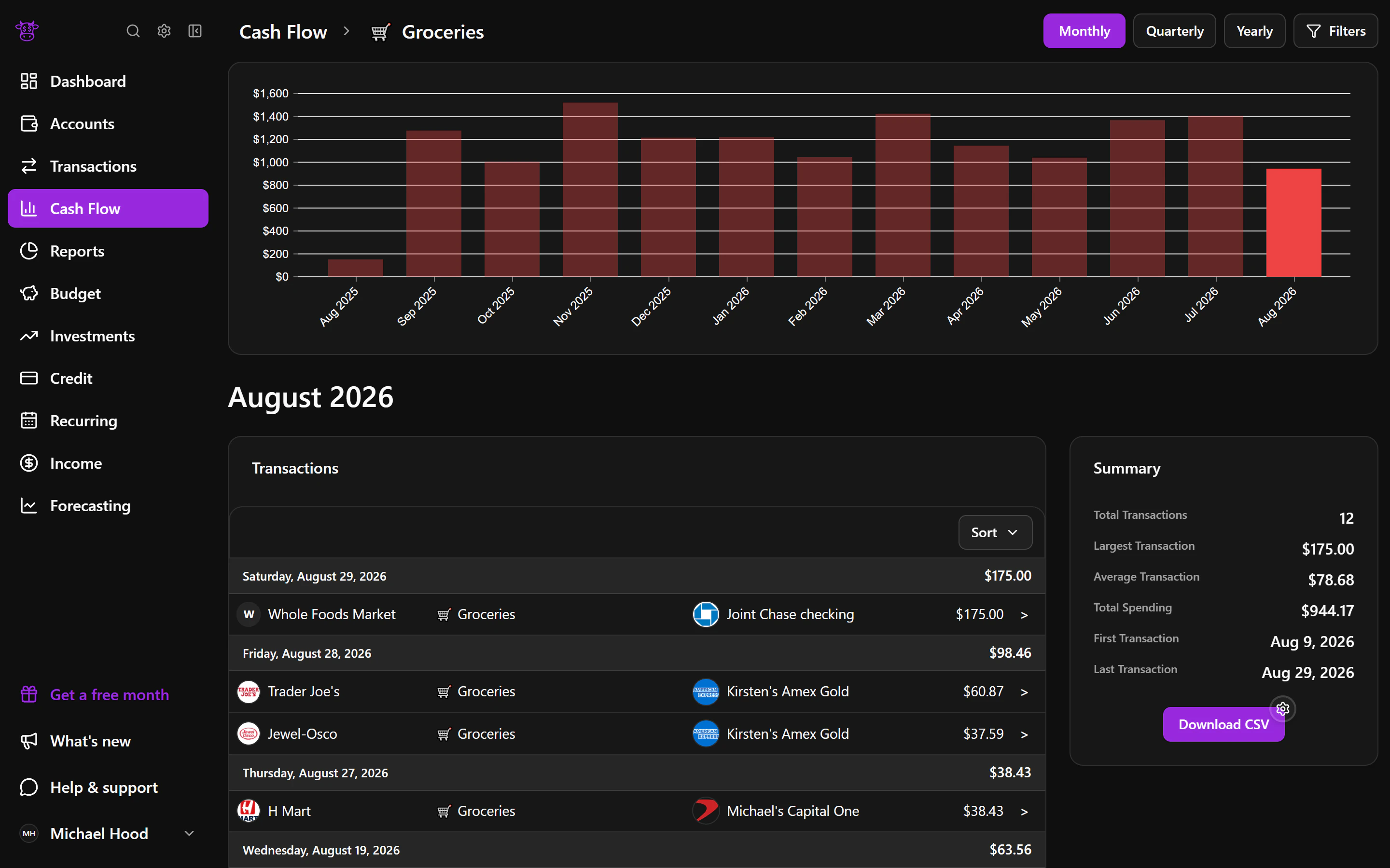
Open a part of the cash-flow chart to see the spending behind it. You can move from a broad trend to the categories, merchants, and transactions that explain the total without losing sight of the overall report.
What you can do
- See spending, income, and net cash flow together
- Follow where money went in a Sankey chart
- Compare periods or choose your own dates
- Open the activity behind a chart result
Useful for
- 01Finding the spending categories that grew this month
- 02Seeing whether a busy month was covered by income
- 03Explaining a change before adjusting your budget